
Nuxt3 Plugin for 'medium-zoom' Library
Today's #tip is an integration of medium-zoom with nuxt3.
medium-zoom is a JavaScript library for zooming images like Medium.
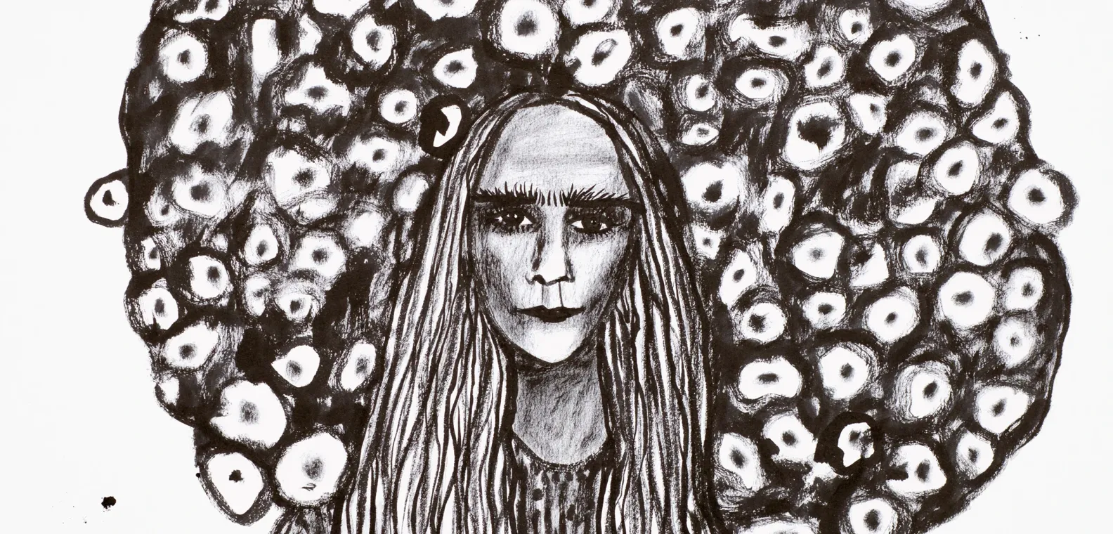
First things first, to see medium-zoom in action, just click/tap on the 'Tree Head' (by @art_ann_kathrin)
Integration
There's no vue component for medium-zoom
1. Install
The integration is implemented as a nuxt plugin.
Install medium-zoom as a dev dependency
yarn add --dev medium-zoom
2. Nuxt3 Plugin
Add following client-side (file name suffix .client.(ts|js)) plugin: ./plugins/medium-zoom.client.ts
import { defineNuxtPlugin } from '#app'
import mediumZoom, { Zoom } from 'medium-zoom'

export default defineNuxtPlugin((nuxtApp) => {
  const selector = '.image-zoomable'
  const zoom: Zoom = mediumZoom(selector, {})

  // (re-)init for newly rendered page, also to work in SPA mode (client-side routing)
  nuxtApp.hook('page:finish', () => {
    zoom.detach(selector)
      .attach(selector)
  })

  // make available as helper to NuxtApp
  nuxtApp.provide('mediumZoom', zoom)
})
Now for each page rendered / client-side navigated to, medium-zoom is applied accordingly for all images in the DOM matching the chosen selector. In our plugin we chose a CSS selector to match all img elements with the class image-zoomable.
You can find all supported selector types in the module's docs.
Running on nuxt - client-side app navigation is done via vue-router. For medium-zoom to do it's magic, it has to be 're-attached' following changes to image on the page. We use the page:finish nuxt3 lifecycle hook as a trigger.
Finally, we also provide the mediumZoom instance as a helper.
Usage
Regular html Image
The most basic example is to use with plain html <img> tag:
<img src="/images/fluffy-cat.jpg" alt="A fluffy cat" class="image-zoomable" />
Nuxt Image Module
Using with <nuxt-image> is done in exactly the same way...
<nuxt-img
    src="/images/fluffy-cat.jpg"
    alt="A fluffy cat"
    width="700"
    height="800"
    sizes="sm:224 lg:448"
    class="image-zoomable"
/>
Note, for <nuxt-picture> the class has to be passed via object to :imgAttrs:
<nuxt-picture
    src="/images/fluffy-cat.jpg"
    alt="A fluffy cat"
    width="700"
    height="800"
    sizes="sm:224 lg:448"
    :imgAttrs="{ class: 'rounded !my-0 !w-32 image-zoomable' }"
/>
Nuxt Content Module - Markdown
With nuxt, it's also fairly simple to apply to nuxt-content markdown images:
{class=image-zoomable}
or alternatively
{.image-zoomable}
The class ist passed as an inline property to the component via {} identifier.
Everything Everywhere All at Once
Often you'd want to use
- a nuxt content page
- written in markdown (image syntax
{class=}) - responsive layout
- optimised image (nuxt-image)
- responsive using (
width,height,sizes) - with additional attributes (
quality,preload)
- responsive using (
- high-definition image to open on zoom (via
data-zoom-src=attrib)
The source code of the demo image at the top of this article is:
{.image-zoomable.rounded data-zoom-src="/assets/blog/5.nuxt3-plugin-medium-zoom/Ann-Kathrin_Foell_TH82_crop.webp" width="2200" height="1055" preload}
NuxtApp Plugin Helper
The mediumZoom helper we provided from the plugin can be decomposed from useNuxtApp() and be used in any component.
Please note our plugin is defined as client-side only, you must therefore access in a client-safe fashion (using e.g. ssrContext)!
Composition API
<script setup lang="ts">
// always access in a client-safe fashion
const { $mediumZoom, ssrContext } = useNuxtApp()
if (!ssrContext) console.log('$mediumZoom margin:', $mediumZoom?.getOptions().margin)
</script>
Advanced
Responsive Margins
To add some icing, for this page I wanted to define different margins at different breakpoints.
The medium-zoom lib uses styles and calculates dimensions of the image's zoomed view dynamically, based on window size (among other factors).
The margin is an option of the library and used in these calculations, rather than applied via css.
The zoomed <img> element is added directly to the body.
Since the margin is defined once at init time of the mediumZoom module instance, it's not possible to make it responsive.
As a workaround / solution the instance is updated via update(..) method, based on window.innerWidth, triggered as an eventListener on window resize.
Finally, to optimise performance vueuse useDebounceFn is used.
import { defineNuxtPlugin } from '#app'
import mediumZoom, { Zoom } from 'medium-zoom'
import { useDebounceFn } from '@vueuse/core'

export default defineNuxtPlugin((nuxtApp) => {
  const selector = '.image-zoomable'
  const innerWidth = window.innerWidth
  const zoom: Zoom = mediumZoom(selector, {
    margin: innerWidth < 640 ? 12 : innerWidth < 1024 ? 24 : innerWidth < 1536 ? 96 : 192,
    background: ''
  })

  // responsive varying margin, calculated based on windowSize, upon @resize, debounced
  const debouncedFn = useDebounceFn(() => {
    const innerWidth = window.innerWidth
    zoom?.update({
      margin: innerWidth < 640 ? 12 : innerWidth < 1024 ? 24 : innerWidth < 1536 ? 96 : 192
    })
  }, 200)

  window.addEventListener('resize', debouncedFn)

  // (re-)init for newly rendered page, also to work in SPA mode (client-side routing)
  nuxtApp.hook('page:finish', () => {
    zoom.detach(selector)
      .attach(selector)
  })

  nuxtApp.provide('mediumZoom', zoom)
})
Conclusion
The medium-zoom library is a great fit for rich content pages with text and images such as blogs. Integration as a nuxt plugin is very convenient and easy.
It's extremely smooth to use in markdown files with nuxt content, and also plays well with nuxt image.
Comment, share, thrive, enjoy!!!
References
- https://medium-zoom.francoischalifour.com/
- https://nuxt.com/docs/guide/directory-structure/plugins#creating-plugins
- https://nuxt.com/docs/api/advanced/hooks
- https://nuxt.com/docs/guide/directory-structure/plugins#automatically-providing-helpers
- https://content.nuxtjs.org/guide/writing/markdown#images
- https://content.nuxtjs.org/guide/writing/mdc#inline-method
- https://vueuse.org/shared/useDebounceFn/